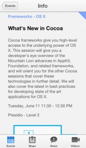
 The tea leaf readers have taken a look at this year’s WWDC app and interpreted it as an accurate representation of “flat” and “black and white” rumors. While I agree that this is an example of both of those ideas done right, I’m not so sure how much I’ll like it system-wide.
Large white backgrounds with black text look best in a well lit area. While that accurately most corporate stooge jobs (including my own) it does not describe the situation while I take my walks at night or use my iPad in bed. I actually write most of my good code after 10:00pm and the lights aren’t necessarily on for that.
