
If there’s one thing Metro does right, it’s how it handles two-apps at one time. Basically, it shows one app at phone width and the other app at full width minus phone width. This is more elegant than Android versions that simply show two apps in arbitrarily smaller than intended viewports because it’s something the developer can (has to, actually) account and test for ahead of time. Let’s try to apply this to iOS…
Most apps that don’t do specific things based on orientation are actually designed (whether the designer actually does this or not) to run in a 768×768 square – then expands whichever dimension gets the 1024 based on orientation. So, in theory, when the iPad is in landscape, it could tell the “big” app that it’s really in portrait but only has 768-20 (for the systemwide menubar) for height. Assuming the app has no code that checks its orientation based on its own height/width ratio, this shouldn’t be a problem.
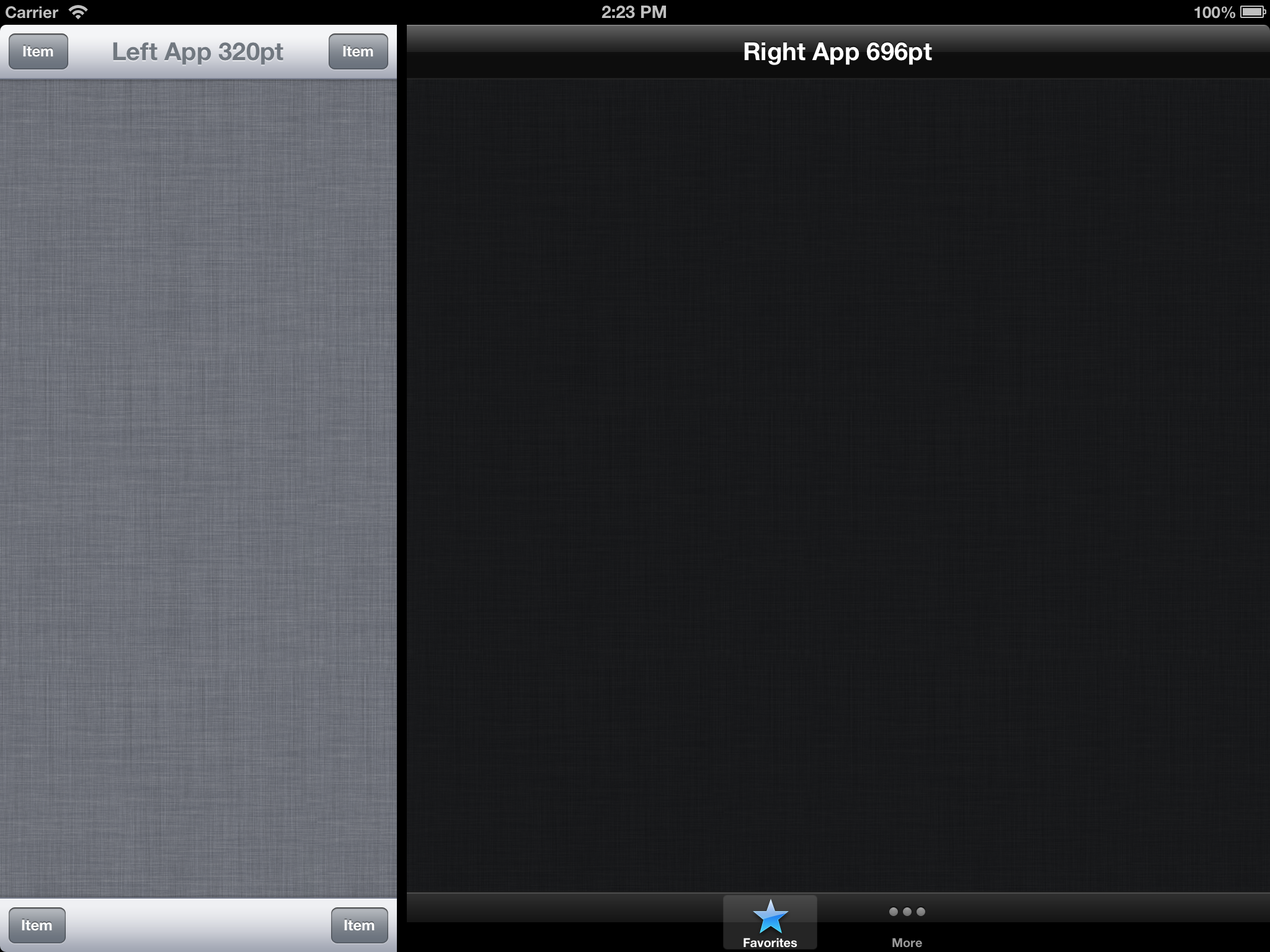
iPhone apps have a portrait width of 320pt and thanks to incall status and iPhone 5 vs 4S sizing, can take up as much vertical space as possible. 320 is a fairly non-negotiable minimum, however, as that’s barely enough room for a titled Navigation bar and back/forward buttons. Since 768+320=1088>1024 (and that doesn’t even include a graphical border), it’s the iPad app that will have to lose some width – which means developers have to support this new size.
So, not only will iPad apps need to support a new size, but iPhone/Universal apps need to as well, and it’s very confusing to people when apps aren’t universal. Netbot/Tweetbot for example, has iPhone and iPad versions, so you would need to download (and buy) the iPhone version for your iPad if you wanted to use it in the small viewport. But the backlash to that would be against Tapbots not Apple so that’s not something Apple has to worry about. Apps would just get two new values in their .plists – canfullscreensmall and canfullscreenbig (or something).
A caveat with universal apps would be that if you were using it in iPad/Big mode and wanted it small, it might have to relaunch if Apple doesn’t change some device specific rules. The built in photo picker for example only runs in iPhone portrait and inside a popover an iPads (and SEGFAULTs if you try to vice versa). Apple would need to allow popovers on iPhone sized apps (iWork’s new document dialogs do something graphically similar). It would also have to change the result of its device idiom and orientation functions.
I think as a prerequisite, Apple needs to completely change the way apps work and get rid of function calls to device orientation and type. Currently, if you have a universal app, the first thing it does is ask if it’s an iPhone app or not and then chose which interface assets to start loading. THIS IS PART OF THE XCODE TEMPLATE. This launch-time decision isn’t something it can easily go back on. If you launched an app as an iPad app, then wanted to shrink it down to 320pt wide, it’s not going to work. Instead, apps need to be responsive. Provide a callback function to viewchangedsize (which rotating the device would call as well as side-by-side operations) and require – absolutely require under penalty of rejection – that all apps submitted for that version of iOS support all devices and orientations through responsive design and not calls to then-deprecated functions that assume fixed layouts. (I suppose games would have the exclusive ability to op out of this).
Apple would also have to change how windows work under the hood with respect to the keyboard. Right now, when you run an iPhone app, it shows the iPhone keyboard in its viewport. That would need to change to see this two-up stuff as “one app” and show the regular full sized keyboard obstructing both apps. Both apps would receive the keyboard visible delegate callback, and would need to be smart enough to do things based on the returned keyboard’s height (and its own height) rather than static integers.
Not that I think it’s a good idea, but this would also open the door to a 1280×800 logically sized “iPad Pro” (2560x1600px), or more realistically, UIKit for OS X with touch (not that that’s particularly likely either). I don’t think any of this is ever going to happen, but that’s how it would have to be done. It’s very non Apple. The idea of doing this in portrait is a joke I’m not going to even attempt to address. I would have a rotate into portrait slide-off the small app the way using mail in portrait hides the message list. Metro’s off-the-screen gestures for doing this are also very un-Apple and I can’t think of an elegant UI for this.
The only way to pull this off smoothly would be to introduce responsive design in iOS 7 (and deprecated the old methods), require it in iOS 8 (completely remove the old methods), and by the time split screen is introduced in iOS 9, apps are already ready for it and Apple doesn’t have to wait for developers.